Your website is built on a responsive platform that is inherently mobile friendly. You will have the ability to further customize by choosing aspects of the page to publish platform wide (default), or a combination between desktop and mobile.
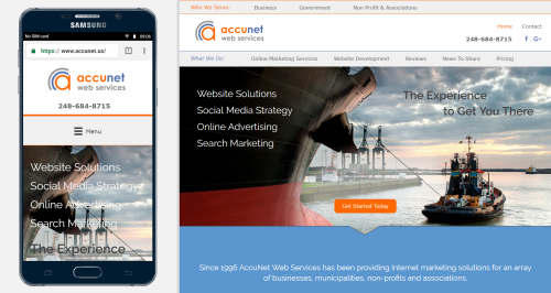
Clarity Cloud/Civic Clarity automatically generates a responsive mobile version of your desktop design. We customize the mobile header and menu as necessary for optimal display. All edits done to the desktop are added to mobile, and clients can override edits within the mobile version if preferred to add/subtract content for different user devices. Most clients leave the mobile display alone, or just edit to tighten margins. But you can do a lot more if you decide you want to.
The service automatically generates a tablet view. If tablet design customization is requested beyond the automatic generation, we will quote the design as a separate project.